Belle

UI/UX Internship

Designed how Belle's AI technology can be implemented in La Roche-posay's website to recommend commercial skin care products based on personal skin conditions.

Overview

As a ui/ux intern, I designed how Belle’s AI technology can be implemented on La Roche-posay’s website to recommend skin care products based on a smartphone photo. Belle's AI technology can distinguish thousands of skin conditions and symptoms. This technology is applicable for healthcare providers, patient clinical trials and monitoring, and consumer skin care.
Time
4 months
Role
UI/UX design Intern
Team
2 design leads and 1 intern
Client
Belle.ai
THE COMPANY
Belle

BelleTorus Corporation (“Belle”) offers the world’s most robust AI-powered skin image analytics and comparison platform to provide healthcare professionals reference text and images based on the algorithm's assessment of similarity of the relative size, texture, and shape/geometry of the patient's skin.

THE TEAM
User Interface & User Experience

As a small start up, the ui/ux team composed of two designers.

THE ROLE
UI/UX intern

As the sole ui/ux intern, I reported directly to two lead designers. I worked on projects from company branding to creating digital prototypes for pitches.


MY WORK
Currently not available for public viewing

I created prototypes of Belle's AI technology on La Roche-posay's website using Figma. Users will take a picture of their skin on their smartphone, upload the photo, then receive customized recommondations of the best La Roche-posay products for them. This project was pitched and well received by La Roche-posay and is currently being implemented on the official website.

REFLECTION

Key takeaways

Understanding multiple stakeholders

This was my first time working as an intern and creating designs to be pitched to major companies like La Roche-posay. Unlike school projects, designing in the real world involves multiple stakeholders. Through my design leads, they shared insight to what design details skincare companies like La Roche-posay are receptive to.

Designing under an existing design system

This was my first time designing under an existing design system. To create effective and believable prototypes for pitches to La Roche-posay, it was important to design within the existing visual language of their current website. I learned to create creative ideas while staying within design constraints.


Background

Each year, NASA hosts an AR design challenge called S.U.I.T.S open to all college students. The goal of S.U.I.T.S is to incubate innovative AR designs to help prepare for the Artemis mission. The purpose of the Artemis mission is to study the landscape for scientific research. Astronauts are tasked with: safely navigating to dedicated geological sampling sites, documenting samples to record important scientific findings, maintaining constant communication with Mission Control and Crew Members for safety.

Project timeline

The challenge

Problem Statement: How can we design AR visual display systems to increase the autonomy of crew members and enhance task performance?

Problem

Problem #1

Cognitive overload

Due to multitasking under high pressure, astronauts may feel overwhelmed and struggle with processing information

Problem #2
Navigation is difficult and risky on the Lunar Surface

Lunar environment is difficult to navigate due to the absence of distinct landmarks and harsh lighting conditions. There are also many tripping hazards such as craters.

Problem #3
Body movements are restricted by space suit

Pressurized space suit drastically limits body movements making it more difficult to grip, walk, and move.

Solution

FEATURE #1
Navigation

○ Traverse lunar landscape with immersive, real time navigation path.

FEATURE #2
Geological Sampling

○ Document samples using pictures and videos and follow along geological sample station specific instructions.

FEATURE #3
Vitals & SUIT Displays

○ Quick and unobtrusive access to intuitive graphs and metics.


Results

As 1 of 8 finalists, we took our design to NASA Johnson Space Center in Houston for on-site field testing and published a paper with MIT Space CHI to share our findings.

UX VISION

Create an AR visual display system to increase the autonomy of crew members and enhance task performance.

RESEARCH CHALLENGE

There was a big problem: I knew nothing about space or designing for AR

RESEARCH

Getting to know the project

In order to learn more about space and AR design, I:

1) Interviewed NASA astronauts, planetary geology experts, and AR designers to understand lunar conditions, what it's like to be on a NASA lunar mission, and how best to design for AR environments.

2) Watched previous lunar missions, read NASA documentation, and listened to past mission recordings

3) Created user journey maps & personas


Qualitative data

3 expert and user interviews

We interviewed NASA astronauts, planetary geology experts, and AR designers to understand lunar conditions, what it's like to be on a NASA lunar mission, and how best to design for AR environments.

James H. Newman

Former NASA Astronaut

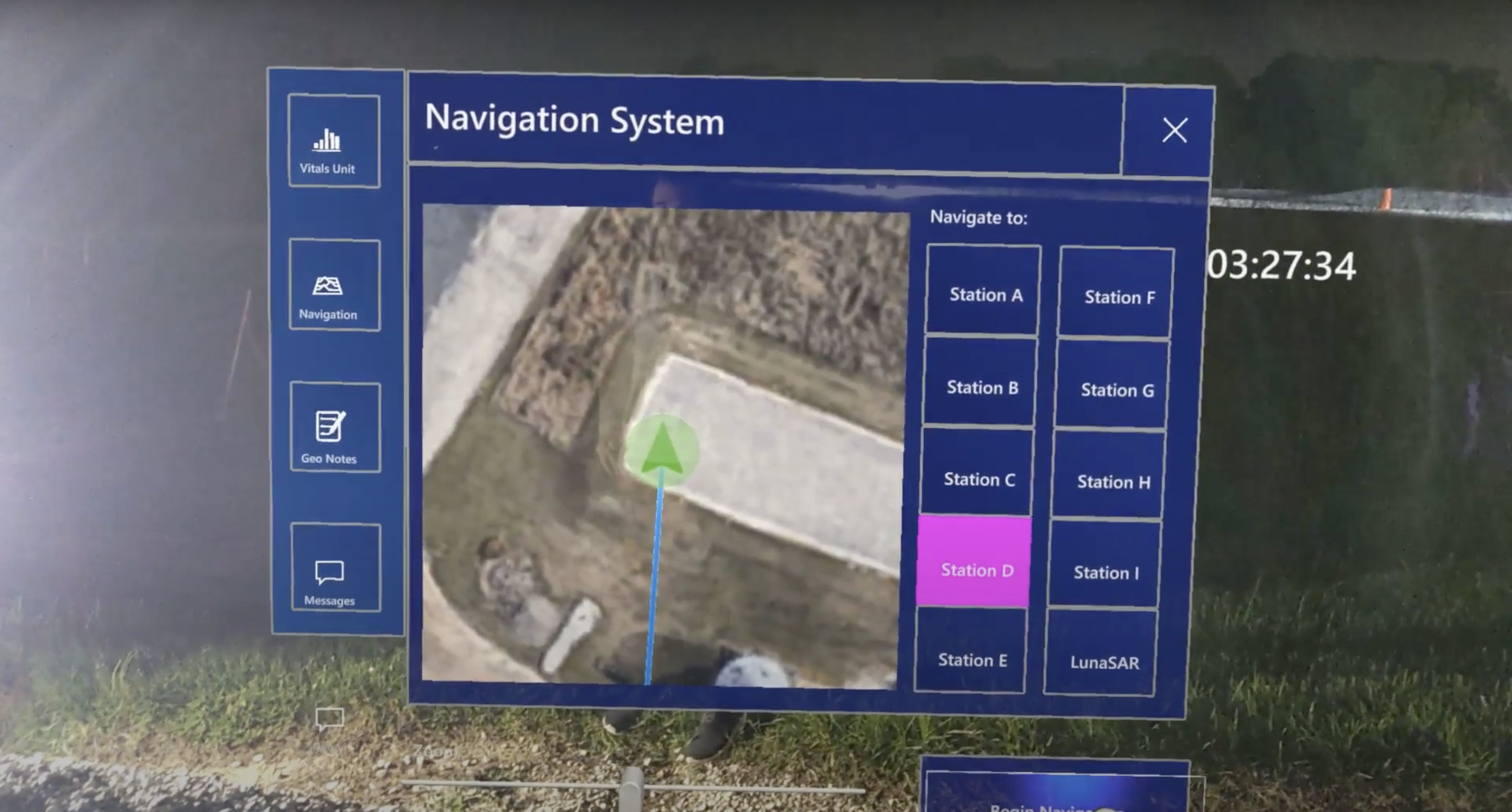
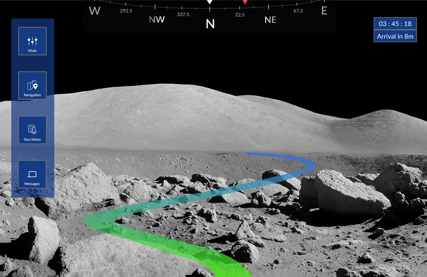
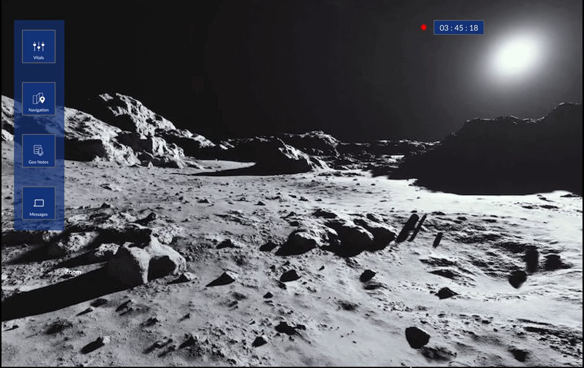
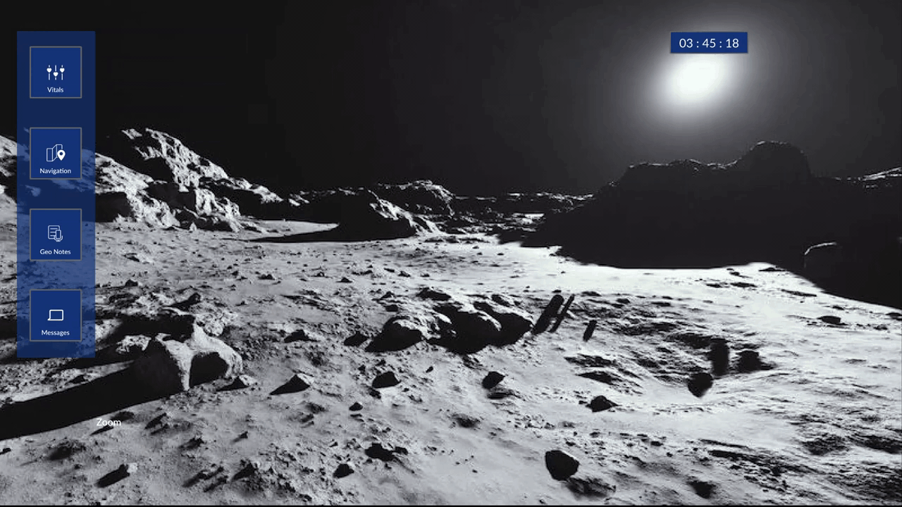
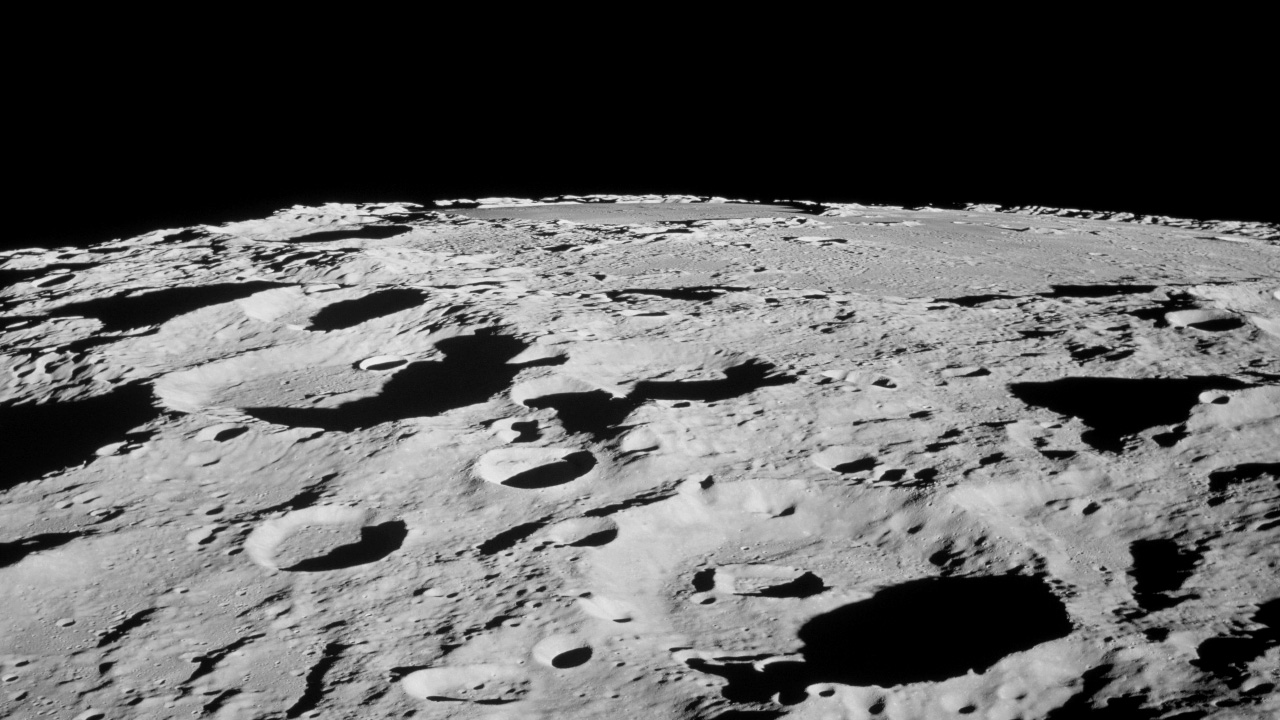
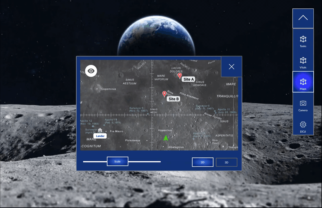
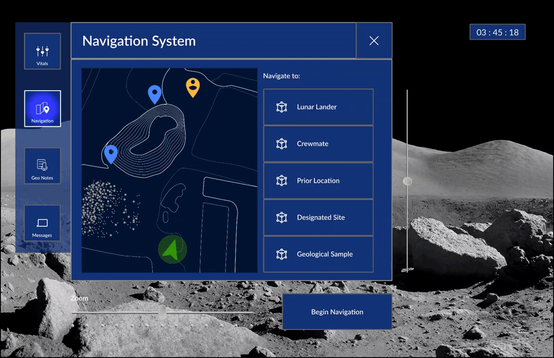
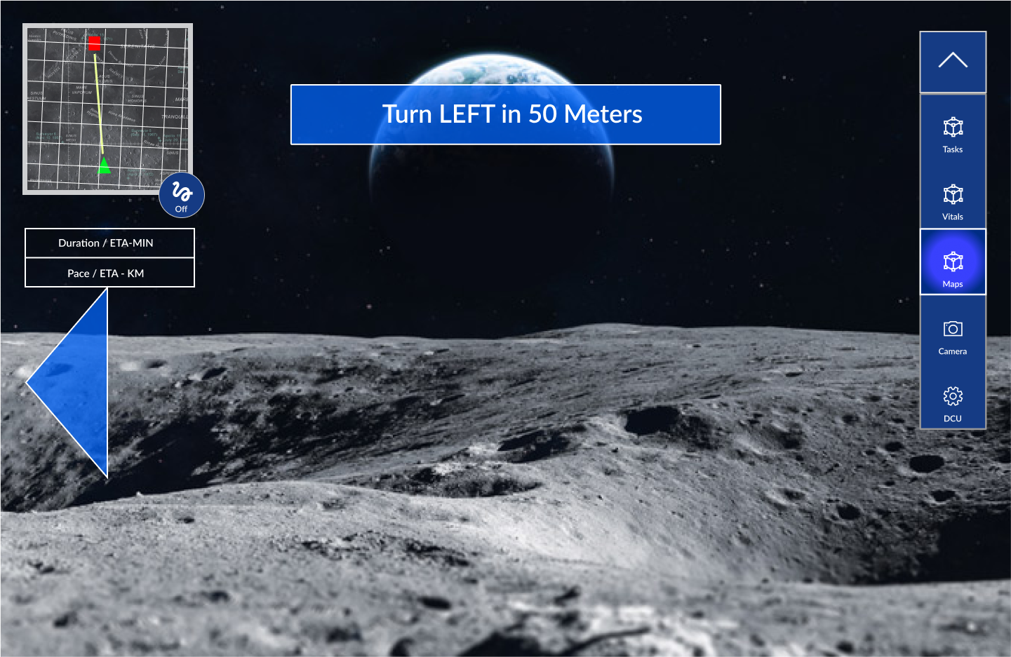
Navigating on lunar terrain

○ Lunar environment is difficult to navigate due to the absence of distinct landmarks.
○ During past Apollo missions, astronauts used rover tracks to navigate.
○ There are also many tripping hazards such as craters.

Steve Swanson

Former NASA Astronaut

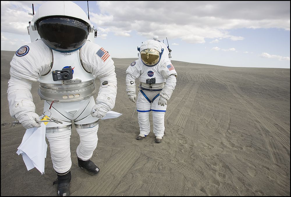
Body movements & cognitive overload

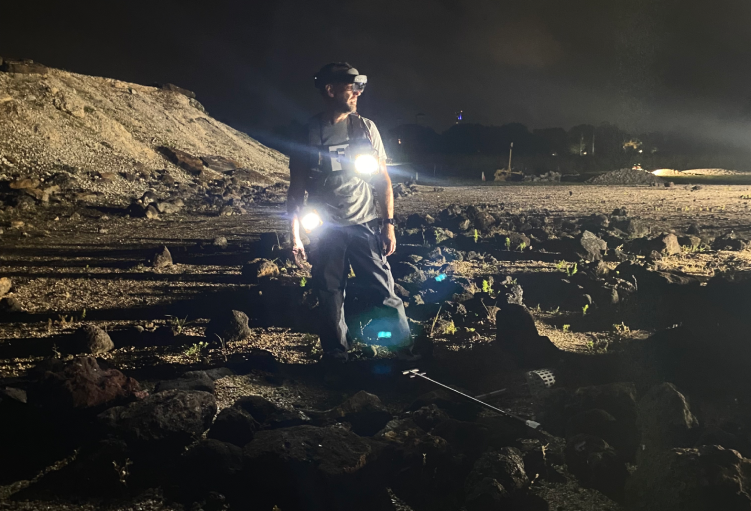
○ Space suit drastically limits body movements. For example, it is difficult to make small hand gestures with gloves on.

○ Due to multitasking under high pressure, astronauts may feel overwhelmed and struggle with processing information.

James Head

Associate Director
of Logistics Systems
@ NASA

Lighting conditions

○ Due to harsh lighting conditions, it is difficult to see where you are going. Some areas are completely in darkness or completely in light.


Diving into NASA's public archives

A plethora of documentation of lunar missions, such as maps of the lunar surface and videos of astronauts conducting missions, are available to the public. I watched previous lunar missions, read NASA documentation, and listened to past mission recordings to get into the headspace of an astronaut.


User journey maps and personas

No items found.

User journey maps created during interviews. Identifying the pain points and potential areas for design intervention during a lunar mission

User journey map & persona I created to synthesize our findings.

SYNTEHSIZE

So... what exactly do astronauts need to do on a space mission?


Key painpoints

After user interviews, personas, journey mapping, I synthesized 3 main painpoints astronauts faced on a lunar mission.

PROBLEM #1

Cognitive overload

Due to multitasking under high pressure, astronauts may feel overwhelmed and struggle with processing information

PROBLEM #2
Navigation is difficult and risky on the Lunar Surface

Lunar environment is difficult to navigate due to the absence of distinct landmarks and harsh lighting conditions. There are also many tripping hazards such as craters.

PROBLEM #3
Body movements are restricted by space suit

Pressurized space suit drastically limits body movements making it more difficult to grip, walk, and move.

What do these findings mean for our design goals?

GOAL #1

Reduce cognitive overload

Important to not bombard astronauts with information and keep interface simple.

GOAL #2
Guided navigation

Visual guide to help navigation in the absence of distinct landmarks.

GOAL #3
Design for restricted body movements

Limit number of actions needed in a task flow. Currently astronauts need to carry a lot of tools for note-taking. We can simplify this process through camera and video documentation.

IDEATION

Feature Ideation

Based on the pain points that we found and the goals that we synthesized, we brainstormed possible features.

Miro exercise for rapidly brainstorming features & narrowing them down.

Final features

After our brainstorming, we synthesized our ideas and narrowed four main features to pursue.

Navigation

○ Long-range point A to point B
○ Short-range terrain mapping
○ Obstacle avoidance

Geological Sampling

○ Documenting and tracking samples

Vitals & Suit Controls

○ Display basic vitals i.e. heart rate and oxygen level
○ Display basic suit controls like suit pressure

Emergency Navigation & Communication System

○ Messaging system for injured and rescue team during an emergency
○ Direct rescuer to injured astronaut

DESIGN

Prototyping & information architecture

After figuring out what features we wanted to focus on for our design, we flushed out each of them through rapid paper prototyping. We then mapped out the information architecture, refining the details. We split our team into groups based on each feature (Navigation, geological sampling, vitals & suits control, and emergency system) and made low fidelity prototypes on Figma. With the help of our engineering team, we then created AR prototypes on the Hololens with Unity.


User testing & applying human factor principles

After implementing our Figma designs on the HoloLens, we invited peers to wear the VR headset. Based on user feedback and human factors principles, we made changes to our feature designs.

1) Hick's Law  

Increasing the number of choices will increase user's decision time logarithmically. During our testing we noticed that too many click options caused confusion and decision paralysis.

Solution:
1. Reduce number of clicks to activate features
2. Unify and simplify elements

Navigation Activation Before Iteration

Activating navigation feature required too many triggers and decisions from the user.

Navigation Activation After Iteration

Reduced the amount of triggers needed to activate navigation feature to three and automatically opened all navigation tools after selecting route.

Menu Before Iteration

Many click options on menu and some features such as camera were not frequently used outside of documenting geological samples.

Menu After Iteration

Unified elements to reduce and simplify choices. For example, DCU and vitals were combined under one menu option. Camera was tucked under Geo Notes and only displayed when needed.

2) Spotlight Model of Attention

User attention is limited. During our testing we noticed that users can only focus on one plane of interaction at a time. In addition, more than two interfaces registered to the hud & following the user caused spatial confusion.

Solution:
Divided features to different different planes of interaction based on frequency of use on the HoloLens

Two Planes of Interaction

○ Frequently used features are registered to the hud.

○ Guidance during task performance in the environment are registered in the environment in a set location

Navigation Mode Before Iteration

Aerial mini map provided long range direction while arrows provided short range direction. Both were registered to the hud.

Navigation Mode After Iteration

Replaced aerial map and arrows with a "breadcrumb pathway" that stuck to the environment and provided comprehensive understanding of short range directions. Compass registered to the hud indicated long range direction.

3) Visual Hierarchy

Vitals & Suit Control Before Iteration

Received user feedback that "vitals & suit controls were difficult to read" due to the lack of visual hierarchy.

Vitals & Suit Control After Iteration

Created visual hierarchy via typography and infographics.

Feedback from NASA

As 1 of 8 finalists, our team was able to go to the NASA Johnson Space Center to test our design and receive feedback.

Intuitive & Creative Tools

"The pathway(3d line) was pretty cool, it led me right to the destination."

"Having an additional map that opens up is helpful on top of the pathway (3d line)."

Simple & Clear Layout

"The buttons worked well, I can see the tools on top of each other and the layout was intuitive. Vitals screen looks clear."

REFLECTIONS

Key takeaways

First time working in a cross-functional team

I learned that communication between the software team and design team was crucial. Designs that seem clever and creative at first may not be easy to code. I learned to create simple and feasible designs with software engineers under our project timeline. More complex designs can be fleshed out once a basic skeleton is coded.

User test as soon as possible

It was crucial to start testing on the HoloLens as quickly as possible as 2D vs AR environment are experienced very differently. We had many design changes after user testing on the HoloLens. Rather than refining our 2D designs on Figma, it was more important to see how basic features are spatially situated.

Next Steps

Flesh out emergency messaging feature

Due to having trouble accessing the telemetry stream, our team was unable to test out our search and rescue messaging feature. In the future, I would like to user test this design feature.

Explore AR as a design medium!

After working with AR for the first time via this project, I'm excited about the potentials of AR as a tool. Specifically, I would like to explore how designs can interact with the physical terrain (i.e. the 3d line in our navigation feature).

Background

Each year, around a quarter of recycling in the US is contaminated by non-recyclables due to poor recycling practices. These contaminated materials end up in the landfill. Most Americans do not know what happens to their waste after it "magically disappears" from their homes. For many, understanding what is recyclable in their city is a confusing process due to inaccessible guidelines.


The challenge

Problem Statement: How can we demystify the recycling process and make access to recycling guidelines easier?


Problem

Problem #1

Ambiguities in the overall recycling process

What, when, and why they should recycle.

Problem #2
Accessing and understanding recycling guidelines in their city

Official websites that contain city guidelines are difficult to navigate and quickly find needed information. When people can not easily understand what is recyclable, they will make an (often incorrect) educated guess when tossing their waste.

Solution

S'ity.earth

Demystifying recycling for sustainable cities.

S'ity -short for sustainable city- is a web app that is the one stop shop to make recycling more accessible and apprehensible through visuals. It serves as an entry point to learn about the impacts of waste. The site helps home sorters properly dispose of waste based on city guidelines.

FEATURE #1
Search for your city's recycling guideline in one place

○ A search bar to easily search for your city

○ Clear categories of recycling that your city accepts (i.e. Barrington, RI accepts 6 different types of recycling: Cartons, Cardboard, Paper, Metal, Glass, & Pastic)

FEATURE #2
Step by step illustrated instructions on how to recycle in your city

○ Easy to follow steps

○ Engaging visuals

FEATURE #3
Track where your waste goes from your local Material Recycling Facility

○ Map that visualizes the journey of our waste after it leaves our homes

○ Demystify the recycling process and understand the global impacts of our waste

FEATURE #4
Commitment to web accessibility

○ A sustainable future relies on the efforts of all. This is why we are working towards making our web app accessible to everyone.

○ Both the light and dark theme conforms to level AA contrast requirements while the high contrast theme conforms to level AAA contrast requirements.

○ Screen reader friendly with semantic HTML, alternative text for images, and easy keyboard naviagation.

FEATURE #5
Built as a web app

○ Easy access on any digital device
○ No need to download through app store

UX VISION

Create a system that demystifies the recycling process and makes finding city recycling guidelines accessible and easy.

Qualitative data

3 User interviews

We conducted user interviews with local RI residents to understand the barriers to recycling correctly. To summarize our findings, we decided to create user personas and user journey maps like the one shown on the right.


On site visits

In our interviews, there was a general consensus that recycling was a confusing process: what colored bins corresponds to recycling? What is recyclable?

To see how well people are currently sorting their trash, we decided to visit recycling bins around RI and observe people throwing away their waste. As we expected, most people mixed up trash and recyclables.

Usability testing

3 Usability tests for RIRRC's website

Rhode Island Resource Recovery Center (RIRRC) is the main facility in Rhode Island that processes recycling. Its website is the official source for RI's recycling guidelines.

We asked 3 users to test the usability of RIRRC's website and learn more about their frustrations. We set up 15-min sessions with them, asking them to find their city's recycling guidelines and give constructive feedback.

Dense and hidden key information

Users expressed that key information such as what was recyclable or not in their city was hidden in RIRRC's website. The RIRRC website links to a 18 page pdf document at the bottom of "Accepted Materials & Pricing" page. The pdf is very dense and formatting makes it hard to find specific material guidelines.

Too many navigation bars

Users expressed that the three navigation bars confused them and made remembering how to access a past page difficult.

Small text & boring visuals

Default text was too small to read comfortably. Visuals on website were not engaging.

KEY INSIGHTS

RI residents did not understand how and what to recycle in their city. Furthermore, finding that information was cumbersome.

SYNTHESIZE

Key problems

After user interviews, personas, journey mapping, and user testing RIRRC's official website, I synthesized 2 main problems when it came to recycling properly.

Problem #1

Ambiguities in the overall recycling process

What, when, and why they should recycle. Most people did not have a commitment to recycling because
1) recycling rules are confusing and 2) they do not understand the environment and economic cost of poor recycling.

Problem #2
Accessing and understanding recycling guidelines in their city is difficult

Official websites that contain city guidelines are difficult to navigate and dense. When people can not easily access and understand answers, they will make an (often incorrect) educated guess when tossing their waste. The typical user is not invested to dig very far for answers.

Initial brainstorm

Competitive analysis

I started off with a competitive analysis not only to understand what products were out there but also to gain inspiration and identify design opportunities.


Engaging users in a meaningful cause

When users feel personally invested about the recycling cause, they are more likely to build recycling habits that will last. Visual storytelling is a powerful tool to engage users and help them understand the impact of their waste habits.


Reducing barriers to reach a larger audience

As I am brainstorming, it became clear that to reach a larger audience, we needed to make our information easily accessible: no installing extra apps or links to other websites or pdfs to find recycling guidelines. This is how we settled on the idea of an web app that was a one-stop-shop for all recycling guidelines in the US.

Two major roadblocks

Why should users care about recycling? What's the story?

We needed to 1) explain recycling guidelines and processes in clear and simple language and 2) tell a compelling, engaging story about why recycling is a meaningful cause. However, we faced a major roadblock: we knew almost nothing about the recycling process.

How do we make our content accessible to reach a larger audience?

It was clear that we needed to make our information easily accessible: no installing extra apps or links to pdfs to find recycling guidelines. But most importantly, our website should be accessible to everyone, not just to those able-bodied. Nearly 16% of the world's population lives with a disability and many of them navigate websites. To ignore this user group is to ignore a huge portion of our potential audience reach. However, we faced another roadblock: we knew almost nothing about designing for web accessibility.

DESIGN CHALLENGE #1

How can we demystify the recycling process when we do not understand it ourselves?

Content research

On site visit: a tour of RIRRC with Education and Outreach Manager

To collect content for our project, we needed to conduct more research. We visited the Rhode Island Resource Recovery Center(RIRRC), the local material recycling facility that handled most of Rhode Island's recycling, to learn about the recycling process first hand. We met with Madison Burke, RIRRC's outreach and resource manager, who gave us a guided tour. Below is a slideshow of what we learned paired with photos that we took at the tour.

Where does our waste go after RIRRC? An interview with Director of Policy

We wanted to know where recycling went after it left RIRRC. Madison Burke could not give us a definitive answer, so she connected us to Jared Rhodes, the director of policy and programs at RIRRC. When we asked him who RIRRC sold their recycling to on a phone interview, he gave a surprising answer: he did not know! Turns out, all the buying and selling of recycling was handled by a third party: CellMark. CellMark auctioned off the recycling to buyers across the world and destinations change daily! This is when we realized what an enormous footprint our recycling had and that the waste industry was at a global scale.

All buying and selling of recycling was handled by a third party: CellMark.

Recycling was sold to buyers across the world from Ecuador to Germany to Saudi Arabia, with destinations changing daily.

Design direction: employing interactive maps and visual storytelling

It quickly became clear that recycling systems in America all strive to be invisible. We simply throw trash in a bin and it gets carted off to be sorted at a Materials Recovery Facility. We are unaware of the hidden costs of our waste intensive lifestyles (i.e. hundreds of workers lining up at a conveyor belt, methane pipes, fences). However, even with our labor-intensive, expensive system, one-quarter of the material ends up contaminated.

The final design will have interactive maps for users to understand the footprint of their waste and visuals to guide users through the recycling process. The primary features are listed below​:

Interactive map

Track where your waste goes from your local Material Recycling Facility and understand its global impacts.

Illustrated guide to recycling

A step by step illustrated guide on how to recycle based on your city guidelines.

CHALLENGE #1 TAKEAWAYS

Work iteratively between research and design; the two inform each other.

There is so much to learn form talking to people directly & going on site.

DESIGN CHALLENGE #2

How can we design for accessiblity?

Learning about web accessibility

71% of website visitors with disabilities will leave a website that is not accessible. A sustainable future relies on the efforts of all. This is why we are committed to making our content accessible to everyone.

This was my first time learning about web accessibility and surrounding guidelines. My research relied on Web Content Accessibility Guidelines (WCAG) and talking to a friend who used a screen reader for dyslexia. Below is a summary of what I learned:

LEARNING #1
Websites need to be screen reader accessible

○ Millions of people rely on screen readers to navigate websites. Not making your website screen reader accessible is to exclude a whole group of users.

LEARNING #2
Keyboard navigation

○ Users often "tab" through elements such as links, buttons, images. It is important to ensure that all elements can be accessed using keyboard commands.

LEARNING #3
Semantic HTML

○ Semantic HTML refers to using HTML code to convey where content is within the structure of a webpage (i.e <header>, <nav> ). Screen readers can identify these tags and provide the user with an understanding of the page structure, making navigation easier.

LEARNING #4
Alternative text to image

○ Alternative text is provided in place of images for people who may not be able to see them. This text gets embedded into the HTML code within the ‘alt’ attribute of the <img> tag, like this:
<img src="carton.jpg” alt="A blue carton in a recycling bin”>.
When a screen reader comes across an image, it will read aloud the alt text which describes the image.

Design direction: accessible features

After learning about web accessibility and its importance, we wanted to make our web app accessible through semantic HTML, alternative text to image, and easy keyboard navigation.

CHALLENGE #2 TAKEAWAYS

Screen reader accessibility should be incorporated into all designs.

DESIGN

Lots of design iterations...

Feedback #1: A more visually engaging landing page: keep users interested.

The landing page is the first thing users see. It should capture the user's eye and represent our mission of demystifying the recycling process. Inspired by the Great Pacific Garbage Patch, we were drawn to the idea of spinning trash: both a mesmerizing, striking visual and a representation of how prominent the world's waste problem is. The circular nature of the spinning trash also references the shape of the earth.

Home page before iteration

Home page after iteration

Feedback #2: Make it easy to search for your city

The wording for the button "categories" was not clear that it would lead to the different recycling categories. Finding your city's recycling guidelines should be a part of the home page for convenient access and a search bar would make the search process faster.

Finding recycling guidelines before iteration

Finding recycling guidelines after iteration

Making designs screen reader accessible

FEATURE #1
Enable tab navigation for all interactive elements

○ Screen reader users use "tab" and other keyboard commads to navigate.

FEATURE #2
Semantic HTML & Alt text for image

○ All elements on our website had semantic html and all our illustrations had alternative text that could be read by a screen reader.

Home Page

Navigation Cards

Search for City Guidelines

Illustrated Instructions

Interactive Map

REFLECTION

Key takeaways

Conducting interviews with experts

This was my first time reaching out to experts in their fields and conducting interviews, an intimidating task. Throughout this process, I learned to 1) conduct as much initial research as possible 2) ask experts questions that cannot be easily found elsewhere and 3) be concise with questions in order to be respectful of their time. That being said, I also found that experts are usually very happy to share their knowledge and the process to be very enjoyable!

Designing for accessibility

This was my first time learning about web-accessibility guidelines and trying to implement them in designs. I learned that many websites are not designed to be accessible and how that can limit the user experience of those with dyslexia, blindness, or deafness. Thinking about users who are not able-bodied is something I believe should happen in every design process.

Next Steps

Conduct usability tests

If I were to continue to work on this project, I would conduct usability tests on our web app on both desktop and mobile formats.

Expand to other cities

Currently, we only have cities in Rhode Island covered. I would like to scale and expand our project to all 50 states in the US.

Other projects